Can you book a GP appointment?
The London Health Mission is a ten-year commitment by London’s public sector leaders to significantly close the gap in health inequalities by 2035. It was set up in direct response to the NHS’s shift to digital, which holds real promise but, without intervention, risks leaving some Londoners behind.
In June 2026 I took part in a London Health Mission hackathon with the Royal College of Art. The brief was to reduce health inequalities in London, where many communities have a healthy life expectancy 20 years less than those living just streets away. My teammate Pranav Babu and I imagined London in 2035, with more healthcare delivered through AI systems, digital portals and automated services. Our problem statement was: “Healthcare exists. Access does not.” We called it Care Map London. I developed it over the following months and showed it at the Mission’s exhibition with LOTI on 7 October.
The problem that inspired it
More of the NHS front door is moving online: registering with a GP, booking an appointment, being triaged (sorted by urgency). For some people, one step can end the journey: no smartphone, limited English, no photo ID, no fixed address.
The evidence already shows the risk. 48% of over-75s cannot complete all eight basic internet tasks (Age UK 2025). 2 in 3 London GP practices refused to register a caller with no fixed address (HSJ mystery shopping, 2023).
I wanted to answer a question no single dataset answers: who would be stopped, at which step, and in which borough, before a service goes fully digital.
What the research uncovered
There is no one dataset for digital exclusion in health. I combined more than a dozen public sources, including the Census 2021, the 2025 Indices of Deprivation, the GP Patient Survey 2026, NHS England releases and the Charity Commission register. They come at different levels, from small areas to GP practices and health boards, so most had to be brought to borough level.
Proxies can point the wrong way. The first version measured how hard it is to reach a GP with a deprivation-based proxy. Switching to the GP Patient Survey itself changed the picture: Hackney, which the proxy rated hardest, is one of the easiest boroughs to reach a GP by phone (68% of patients surveyed say it is easy).
Averages hide the people at risk. An average can look fine while a small group is shut out, and the survey only hears from people already registered with a GP.
Data goes out of date fast. On the morning of the exhibition I replaced two cited statistics that newer official releases had superseded. Borough figures are now rebuilt from public downloads by scripts, with tests that flag any change.
What I built, and how it works
Care Map London is a prototype decision-support tool with three faces: a two-minute touch kiosk, a dashboard and a phone view. Underneath is one simple model:
- Six composite personas, built from published research, try five future NHS services, each broken into eight steps such as getting online, uploading photo ID and proving your address.
- Each step starts with a difficulty rating from 0 (no barrier) to 3 (blocked), a judgement based on published evidence.
- Borough data then makes a step harder or easier. High digital exclusion makes online steps harder; in the model, a council’s Borough of Sanctuary award, a welcome pledge, eases identity steps.
- The result is where each persona stops, borough by borough. Across 198 runs of a fully digital GP portal (six personas in each of 33 areas), 129 stop before the end (model estimate).
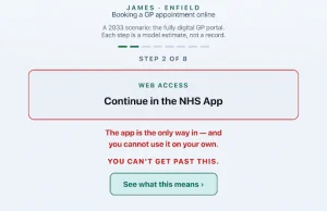
At the kiosk, James, an 80-year-old who is offline, stops at step 2 of 8 of a 2033 fully digital GP portal in Enfield. A model estimate, not a record.
Place changes the result. In the model, Elena, a composite persona (not a real person) of a trafficking survivor with no ID, has a safety score of 9 out of 95 in Bexley and 73 in Hackney (higher means more local support for someone like her; model estimate). Design matters too, at least for her: her access failure is 45 with a human Community Health Navigator and 80 with NHS 111 AI triage (0–100, the 2025 London average, model estimate), both modelled future services.
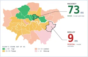
Elena’s safety score out of 95 in each of London’s 32 boroughs and the City. A model estimate on public data. Elena is one of six composite personas.
On the dashboard, you get two budget points to spend in a borough on changes such as interpreting, digital inclusion or GP capacity, and see who each choice helps and who is left out.
What’s next?
To develop the Care Map further, I’d be interested in working with those that work in digital, data or tech in London local government, to check the data, try the method on a real service, help bring in lived experience or host a kiosk. If you are interested in learning more, please get in touch directly.
This blog is written by Yongwoo Lee, a designer from the Royal College of Art. He developed Care Map London, which began at a London Health Mission hackathon with Pranav Babu.
Please note, to represent the best interest of our members, LOTI does not favour or endorse the products and services of any one company mentioned in any of our blogs. For more information, visit our approach webpage.